
CSS(Cascading Style Sheet)层叠级联样式表
CSS3 概述
- CSS3 在 CSS2 版本的基础上,新增了很多特性,例如边框圆角、动画效果
- 在 CSS2 的时代,实现圆角必须要用图片才能实现,而 CSS3 只要一行样式就能实现圆角
- 在 CSS3 的时代,动画效果一定要使用 JavaScript 配合复杂的 CSS 样式操作才能实现(或者用 jQuery 这种第三方库),CSS3 同样可以简单地实现动画效果,而且效果更佳
- 早些年头,因为浏览器的兼容问题,并未广泛引用,但是近几年,随着随着各大浏览器厂商的标准化,大家可以畅快第使用 CSS3 了
CSS3 新特性
- 边框圆角
- 阴影
- 形变:旋转、缩放、位移
- 过渡效果
- 动画效果
- 媒体查询
- 弹性布局
- 网格布局
- 等等(选择器、字体)……
CSS的三种导入方式
行内样式(内联)
<!--内联样式权重高于嵌入样式,不建议使用,用得越多就越难维护-->
<h1 style="color: yellow">标题</h1>
嵌入样式
<style>
    h1{
        color: red;
    }
</style>
外部样式(推荐)
HTML文件中使用link标签引入外部样式(链接式)
<link rel="stylesheet" href="CSS/style.css">
HTML文件中在style标签内使用@import(导入式)
<style>
    /*CSS 2.1所特有的写法,不推荐使用*/
    @import url("第一个CSS程序/CSS/style.css");
</style>
CSS文件
/*CSS注释*/
h1{
    color: blue;
}
三种方式的优先级
- 行内样式最优先
- 内部样式和外部样式谁后执行谁生效
选择器
基本选择器
id选择器
#id-name{

}
标签选择器
/*选择P标签*/
p{

}
类选择器
.class-name{

}
<!--一个标签可以加多个class-->
<h1 class="class1 class2">
    hello
</h1>
通配符选择器
*{

}
选择器优先级
相同选择器:后面的覆盖前面的
不同选择器:id选择器(100)>class选择器(10)>标签选择器(1)
层级选择器:按权重累加计算
<style>
    /*100+10=110*/
    .box #txt{
        color:red;
	}
    /*100+1=101*/
    #box2 h1{
        color:blue;
        /*color:blue !important;
        这样写可以设置最高权重
        */
    }
</style>
<div class="box" id="box2">
    <h1 class="title title2" id="txt">
        hello
    </h1>
</div>
层级选择器
后代选择器
/*选中body标签下的所有P标签*/
body p{

}
子代选择器
/*只选中直属于body标签的P标签,不包括body中其他标签下的*/
body>p{

}
相邻兄弟选择器
/*只选中属于class类的P标签的下一个P标签*/
.class+p{

}
通用选择器
/*选中所有属于class类的P标签向下的所有P标签*/
.class~p{

}
组合选择器
h1,h2{

}
结构伪类选择器(条件)
/*选中ul的第一个子元素*/
ul li:first-child{

}
/*选中ul的最后一个子元素*/
ul li:last-child{

}
/*从当前p元素的父级元素下选择第2个元素,第2个元素是P才生效*/
p:nth-child(2){

}
/*从当前p元素的父级元素下选择第1个p元素*/
p:nth-of-type(1){

}
/*鼠标移动到a标签上时对a标签生效*/
a:hover{

}
/*鼠标移动到a标签上时对p标签生效*/
a:hover > p{

}
伪元素选择器(增加元素)
/*
CSS2:伪类选择器和伪元素选择器都是一个冒号
CSS3:让伪元素选择器增加一个冒号
目前浏览器两者都支持
*/
h1::before{
    content:"在h1前面"
}
h1::after{
    content:"在h1后面"
}

/*可以起到装饰作用*/
.classname::before,.classname::before{
	content:"-----"
}
属性选择器
<!DOCTYPE html>
<html lang="en">
<head>
    <meta charset="UTF-8">
    <title>Title</title>
    <style>
        .main a{
            float: left;
            color: #bd200d;
            background: blue;
            display: block;
            text-align: center;
            height: 50px;
            width: 50px;
            border-radius: 50px;
            font: bold 20px/50px Arial;
            margin-right: 10px;
            text-decoration: none;
        }
        /*属性选择器
        语法:a[]{}
        []中可以写属性名、属性名=属性值
        = 绝对相等
        *= 包含
        ^= 以这个开头
        $= 以这个结尾
        ……
        */
        /*存在id属性的元素*/
        a[id]{
            color: black;
        }
        /*id为特定值的元素*/
        a[id="id1"]{
            color: aqua;
        }
        /*id中存在2的元素*/
        a[id*="2"]{
            color: yellow;
        }
        /*class中存在b的元素*/
        a[class*="b"]{
            background: gray;
        }
        /*href中以http开头的元素*/
        a[href^="http"]{
            width: 100px;
        }
        /*href中以ppt结尾的元素*/
        a[href$="ppt"]{
            height: 100px;
        }
        /*a类中有id的元素*/
        .a[id]{
            width: 200px;
        }
    </style>
</head>
<body class="main">
<a href="https://www.baidu.com" class="a b c" id="id1">1</a>
<a href="https://www.jd.com">2</a>
<a href="https://www.taobao.com">3</a>
<a href="image/a.png" class="a" id="id2">4</a>
<a href="image/b.jpg" class="b" id="id3">5</a>
<a href="video/c.mp4" class="c">6</a>
<a href="audio/d.mp3">7</a>
<a href="file/e.ppt" class="a c">8</a>
<a href="file/f.docx" class="b c">9</a>
<a href="file/g.xls" class="a b">10</a>
</body>
</html>
美化网页元素
字体样式
<!--
font-family: 字体(中英文字体用,隔开);
font-size: 字体大小(单位px,em……);chrom浏览器最小值为12px
font-weight: 字体粗细(bold 粗体,也可以用数字);
color: 字体颜色;
line-height: 行高;
font-style: 字体风格(oblique 斜体);
-->
<style>
    body{
        font: oblique bold 20px/50px "楷体";
    }
    a{
        font-family: "Times New Roman" ,楷体;
        font-size: 50px;
        font-weight: bold;
        color: red;
        line-height: 50px;
        font-style: oblique;
    }
</style>
文本样式
<!--
color颜色:
1.单词(red,green,blue...)
2.RGB(color:rgb(0,255,0))
3.RGBA(color:rgba(0,0,255,0.1))
R:红(0~255)
G:绿(0~255)
B:蓝(0~255)
A:透明度(0~1)

排版水平居中 text-align: center;
首行缩进2字符 text-indent: 2em;

行高和块的高度一致时就可以上下居中:
height: 200px;
line-height: 200px;

下划线 text-decoration: underline;
中划线 text-decoration: line-through;
上划线 text-decoration: overline;
去划线 text-decoration: none;
垂直居中 vertical-align: middle;
-->
<style>
    h1{
        color: rgba(0,255,0,20%);
        text-align: center;
    }
    p{
        text-indent: 2em;
        height: 200px;
        line-height: 200px;
        text-decoration: underline;
    }
    /*去超链接的下划线*/
    a{
        text-decoration: none;
    }
    /*多标签选择器*/
    img,span{
        /*垂直居中排列*/
        vertical-align: middle;
    }
</style>

<p>
    <img src="../Resources/image/Cover.jpg">
    <span>文字</span>
</p>
超链接伪类
<!DOCTYPE html>
<html lang="en">
<head>
    <meta charset="UTF-8">
    <title>Title</title>
    <style>
        /*初始状态*/
        a{
            color: black;
            text-decoration: none;
        }
        /*鼠标悬停状态*/
        a:hover{
            color: orange;
        }
        /*鼠标按住未释放的状态*/
        a:active{
            color: blue;
        }
        /*以上三个可以同时存在,都能生效*/
        /*链接被访问过的状态*/
        a:visited{
            color: gray;
        }
        /*链接未被访问过的状态*/
        a:link{
            color: red;
        }
        /*visited和link优先级最高,只要有一个生效,其他的就不生效了*/
    </style>
</head>
<body>
<a href="https://www.baidu.com????" target="_blank">百度</a>
</body>
</html>
文字阴影(text-shadow)
文字阴影(text-shadow)列表样式(list-style)
none:去掉圆点
圈子:空心圆
方形:方块
十进制:数字
inside:列表样式在边距之内
圈子:空心圆
方形:方块
十进制:数字
inside:列表样式在边距之内
<!DOCTYPE html>
<html lang="en">
<head>
<meta charset="UTF-8">
<title>Title</title>
<style>
#nav{
background: gray;
width: 180px;
height: 140px;
}
.title{
color: black;
font-size: 15px;
font-weight: bold;
height: 30px;
line-height: 30px;
background: red;
text-indent: 1em;
margin-bottom: -10px;
}
ul li{
height: 20px;
list-style: none;
}
a{
color: #090909;
font-size: 10px;
text-decoration: none;
}
a:hover{
color: orange;
text-decoration: underline;
}
</style>
</head>
<body>
<div id="nav">
<h2 class="title">全部商品分类</h2>
<ul>
<li><a href="#">图书</a> <a href="#">居家</a></li>
<li><a href="#">电器</a> <a href="#">服装</a></li>
<li><a href="#">数码</a> <a href="#">办公</a></li>
<li><a href="#">彩票</a> <a href="#">食品</a></li>
</ul>
</div>
</body>
</html>
背景
<!DOCTYPE html>
<html lang="en">
<head>
    <meta charset="UTF-8">
    <title>Title</title>
    <style>
        body{
            /*渐变色*/
            background-color: #4158D0;
            background-image: linear-gradient(13deg, #4158D0 0%, #C850C0 46%, #FFCC70 100%);
        }
        div{
            height: 1000px;
            width: 1000px;
            /*border:边框宽度,边框样式(solid实线),边框颜色*/
            border: 1px solid red;
            background-image: url("../../Resources/image/kl.jpg");
            /*默认是平铺的*/
            background-repeat: repeat;
        }
        #div1{
            /*横向平铺*/
            background-repeat: repeat-x;
        }
        #div2{
            /*纵向平铺*/
            background-repeat: repeat-y;
        }
        #div3{
            /*不平铺*/
            background-repeat: no-repeat;
            background-position: 100px 200px;
        }
    </style>
</head>
<body>
<div id="div1"></div>
<div id="div2"></div>
<div id="div3"></div>
<div id="div4"></div>
</body>
</html>
盒子模型
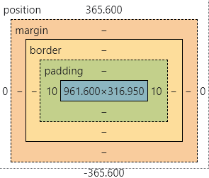
margin:外边距:top\right\bottom\left padding内边距:top\right\bottom\left border:边框:width\style\color(border属性简写的三个值是没有顺序要求的)
border-style:
| 值 | 描述 |
| 没有 | 定义无边框 |
| 点缀 | 定义点状边框 |
| 虚线 | 定义虚线 |
| 固体 | 定义实线 |
| 双 | 定义双线 |
元素宽高计算
- 默认情况下
元素的实际宽度 = 左边框 + 右边框 + 宽度 + 左填充 + 右填充;
元素的实际高度 = 上边框 + 下边框 + 宽度 + 顶部填充 + 下填充;
元素的实际高度 = 上边框 + 下边框 + 宽度 + 顶部填充 + 下填充;
- 设置box-ssize:border-box;(很方便的属性)
<!DOCTYPE html>
<html lang="en">
<head>
    <meta charset="UTF-8">
    <title>Title</title>
    <style>

        /*元素边距初始化*/
        *{
            margin: 0;
            padding:0;
            box-sizing:border-box;
        }

        #login{
            border: 1px solid gray;

            /*auto自动对齐实现元素水平居中*/
            margin: 0 auto;
            padding: 0;
            width: 300px;
        }
        #login div:nth-of-type(1) input{
            /*border:粗细 样式(solid:实线,dashed:虚线) 颜色*/
            border: 3px solid black;
        }
        #login div:nth-of-type(2) input{
            border: 3px dashed red;
        }
        form{
            background-color: orange;
        }
        input[type=submit]{
            color: #bd200d;
            background-color: #C850C0;
        }
        input[type=submit]:hover{
            color: #4158D0;
        }
        #app>div>img{
            width: 100px;
            height: 100px;
            /*设置边框圆角*/
            border-radius: 50px;
            /*居中*/
            display: block;/*把img从内联元素变为块元素*/
            margin: 0 auto;
            /*设置边框阴影*/
            /* 颜色 水平偏移 垂直偏移 模糊距离*/
            box-shadow: #bd200d 0px 0px 20px;
        }
    </style>
</head>
<body>
<div id="app">
    <div>
        <img src="../../Resources/image/kl.jpg">
    </div>
    <div id="login">
        <h2>登录</h2>
        <form action="#">
            <div id="username">
                <span>用户名:</span>
                <input type="text">
            </div>
            <div>
                <span>密码:</span>
                <input type="password">
            </div>
            <div>
                <input type="submit" value="登录">
            </div>
        </form>
    </div>

</div>
</body>
</html>
未完待续
本人持续性学习中……
希望这篇文章能够帮助到大家,如果转载请标注原文地址哦,十分感谢!